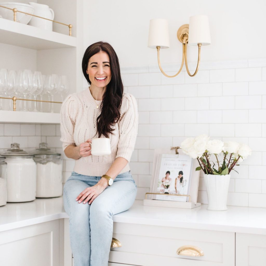
Inside you’ll find all the details of our Fraîche Office! I created a beautiful space for myself and the team with a special touch of Parisian style. Let me be your guide! Grab a cup of tea, sit back, and enjoy the Fraîche Office Tour.
Charles and I actually call the office “Paris” (France is one of my favourite places in the whole world) and now I have my own little slice of France next door to my home. Yes, we meet for coffee in “Paris” most mornings!
I always dreamed of having my very own space for Team Fraîche. A space to call our very own to be creative and dream big. A lot of love (plus one extremely handy husband) and elbow grease went into this addition, and I couldn’t be happier to finally share the details with you.
Paint Colour
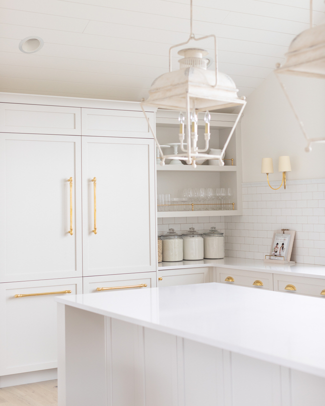
I decided to go with two of my favourite Benjamin Moore paint colours in this kitchen. BM Simply White (with an eggshell finish) on the walls and BM Classic Gray for the cabinetry. One, because I need to keep the space light and airy for photography. Two, because I am super familiar with these colours and know I will love them for a long time! They are classics. If you need help picking the “perfect” white head to my blog here with all my go-to’s.
Kitchen Cabinets
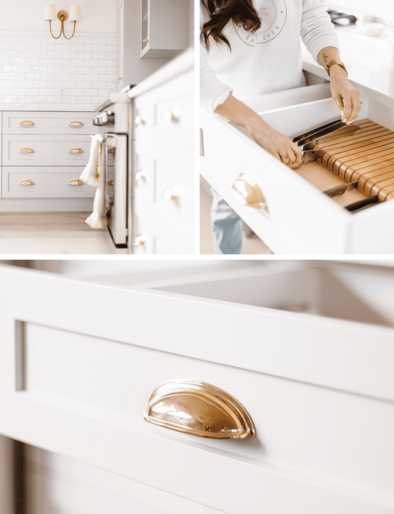
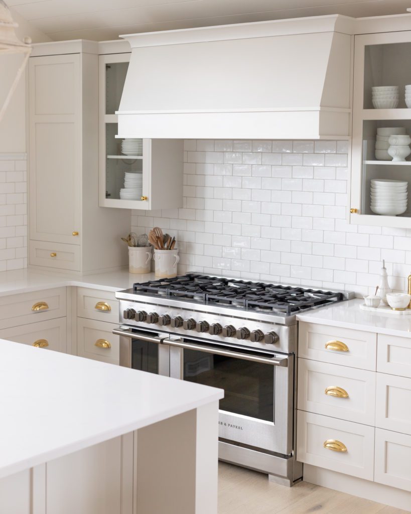
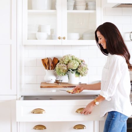
Like I said above, I went with stunning Classic Gray cabinets from my dear friends at Norelco. I went with a traditional shaker profile complete with a few glass doors to showcase some dinnerware, a custom knife drawer, drawer organizers, and even a few open shelves. Norelco also designed our home kitchen, and I’m just as impressed this time as I was last time. I couldn’t recommend them more, they are amazing!
Brass Hardware
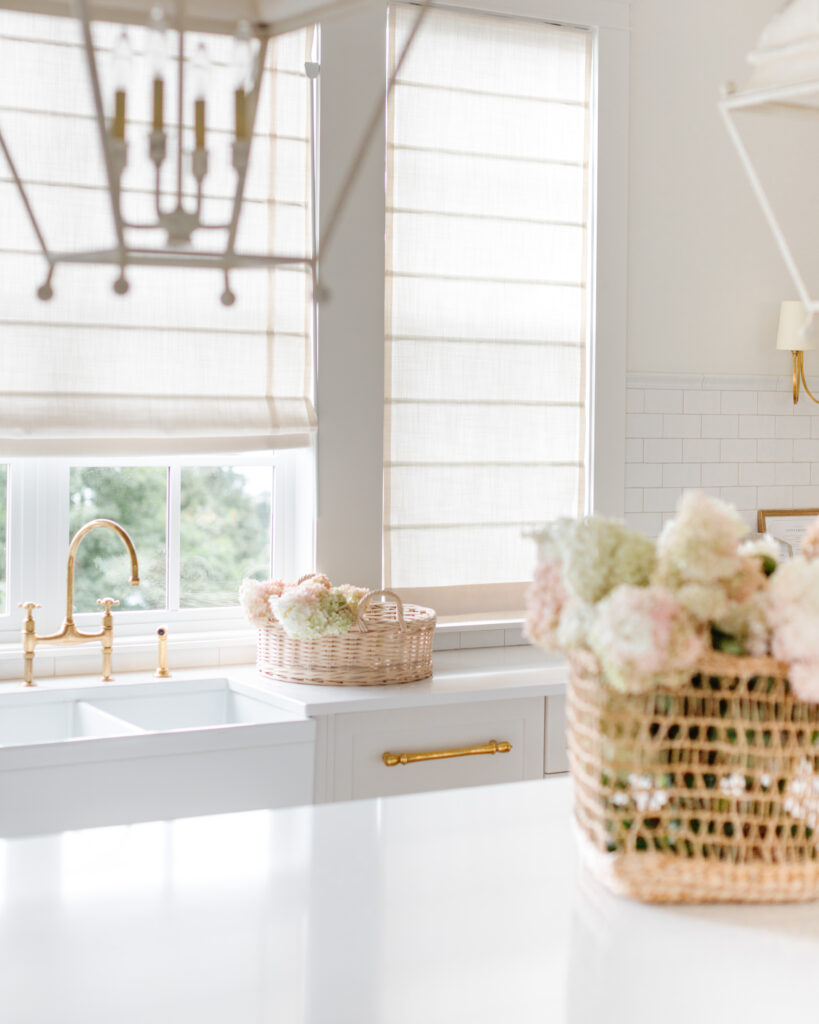
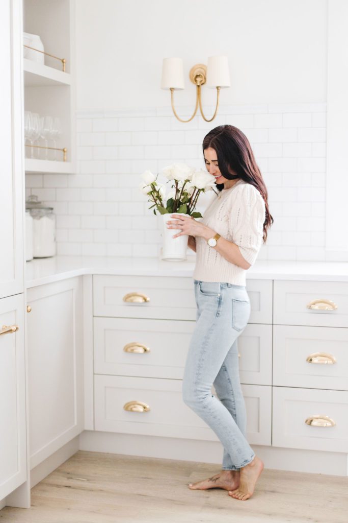
My love for brass runs pretty deep. I knew I wanted to add touches of brass to give it an antique, European feel. I went with the most PERFECT Emtek hardware (these 4″ cup pulls, these knobs and these cabinet latches) in a polished brass, knowing it will patina over time.
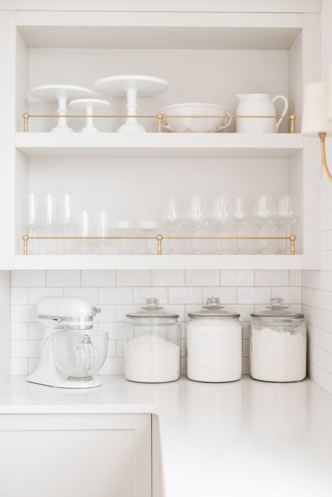
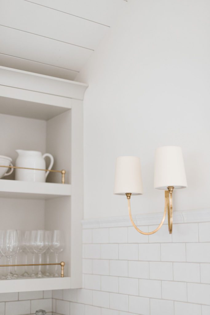
I decided to take my open shelves to another level with these brass railings from Paxton Hardware for a I love it so much and works so well for storing pretty glassware. This little corner is one of my favourites.
Countertops
The real star of the show in this whole kitchen space are the island and countertops by Cosentino. I chose quartz for a number of reasons, but mostly love how durable it is: and BEAUTIFUL! I chose the same finish and pattern as our home, I loved it so much: Silestone’s Statuario. It has the perfect veining, reminiscent of Carrera marble. We had it installed by Absolut Granite in Kelowna, and they were truly amazing. They were professional, so friendly (customer service is huge to me), and their work was on-point.
The dimensions of our office kitchen island are 9.7′ x 4.3′ to be exact, and are 36″ high (standard height). I LOVE these dimensions: I would do this again in a heartbeat. For this space we chose to leave the island as a work space only (no sink or appliances), and it is really a dream given that there are usually four of us working on it at one time!
Kitchen Appliances
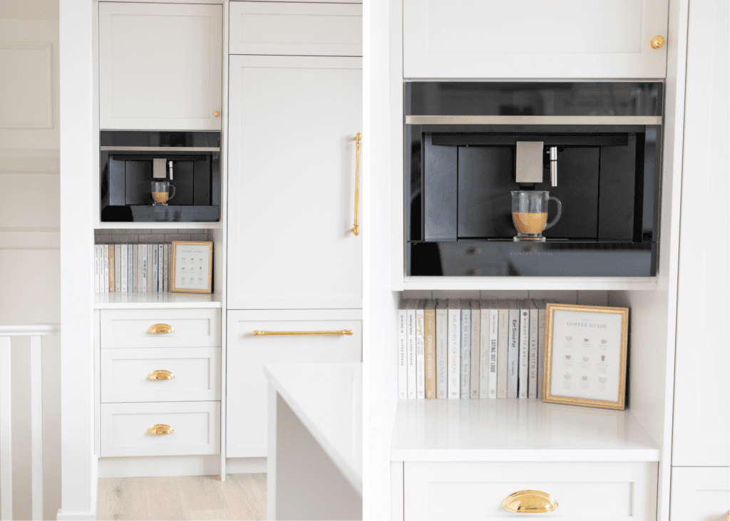
I went with all Fisher & Paykel appliances in the space from Coast Appliances here in Kelowna (fridge, stove, dishwasher, coffee machine), same as in my home. An 8-burner gas range with dual stoves to accommodate our big family gatherings and A LOT of cooking production with my team. I also really like that it doesn’t have digital controls (love the traditional dials). The double fridge is integrated (panels from the fabulous Norelco, again), same goes for the dishwasher. The Spindle Appliance Pulls are from Emtek.
I decided to not install a pot filler in this kitchen (I have one in my house) and I haven’t missed it once!
Coffee Machine
We take coffee very seriously at Team Fraîche! But in all honesty, this appliance gets more mileage than I would have ever dreamed! Mostly by Charles, sneaking up to the office for quiet time in the mornings. I think he under-estimated how much he would personally enjoy my office haha! The coffee machine is from Fisher and Paykel too. We love coffee so much we even made an art print out of it!
Kitchen Lighting
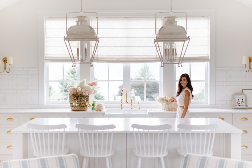
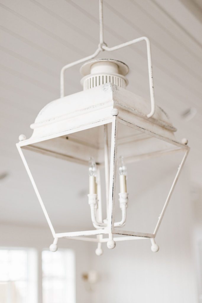
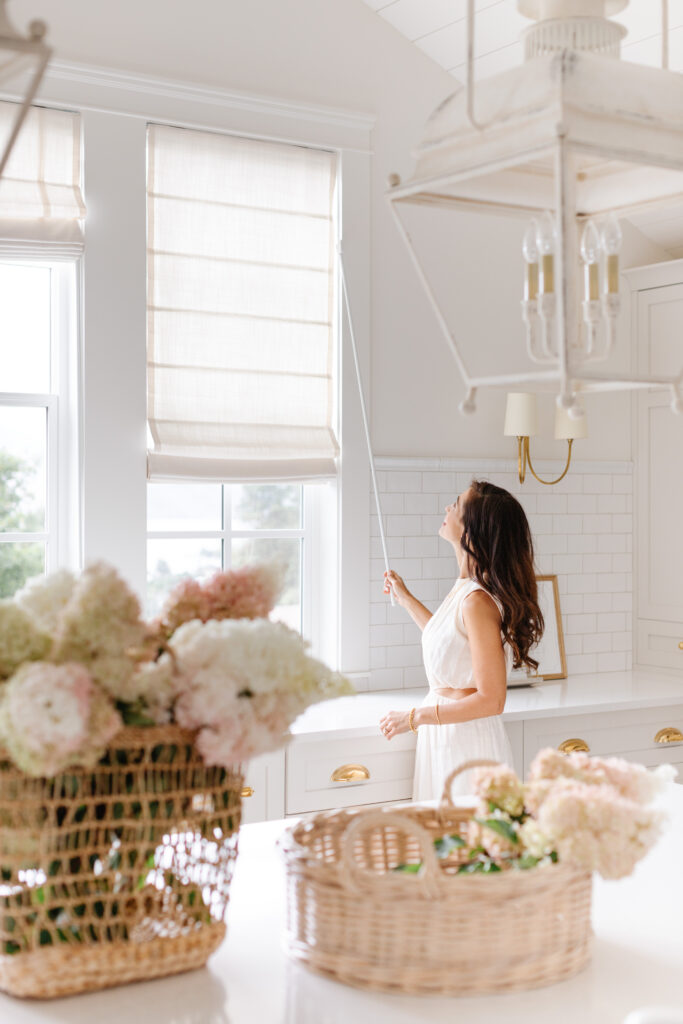
It is hard to tell from pictures, but this space is massive in height! With tall vaulted ceilings, I knew I needed to scale up the lighting to balance out the space above the island. Enter: The Holborn Lantern. Beautiful lighting makes all the difference.
This four candle light has intricate metal detailing, including tapered sides and a distressed antique white finish. I removed the glass and adore the way it looks: no need for constant cleaning and no glare when I use this space for photography.
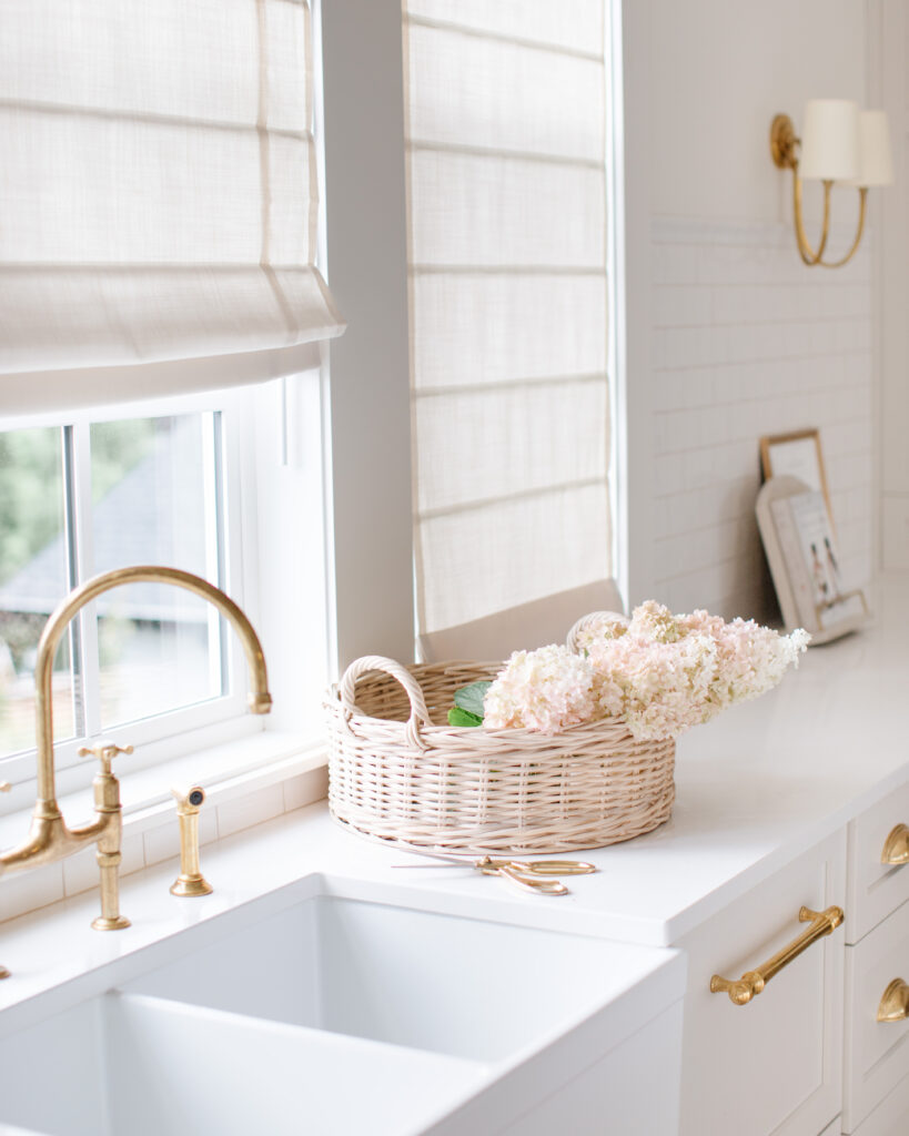
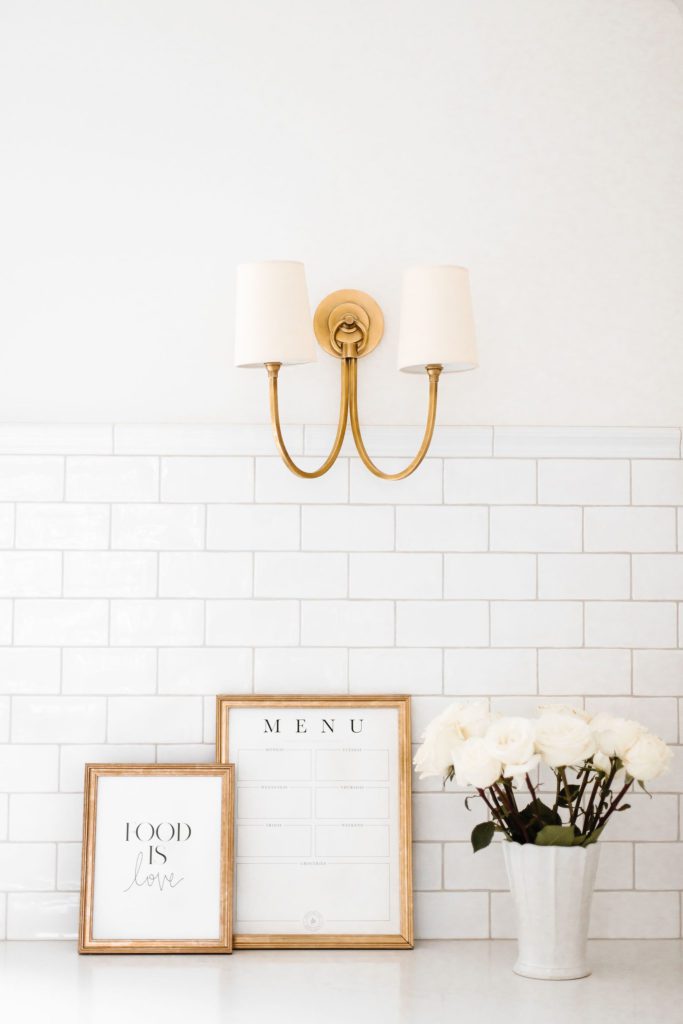
I tied in more of the brass detailing I love through these double wall sconces with off-white shades. Perfect, simple elegance!
Kitchen Sink
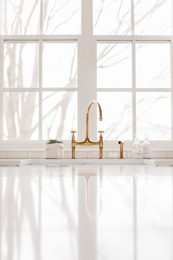
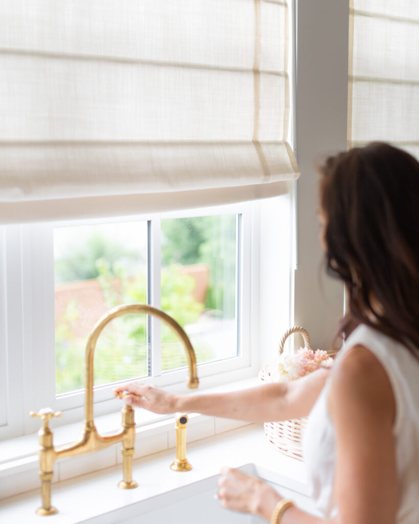
This space sees lots and lots of dishes, so the sink had to be both beautiful and functional. I went with a large double farmhouse sink at a great price from Wayfair (always go double if you can!), but the real show stopper in this space is the faucet! It is from De Vol and is totally reminiscent of vintage French taps with a lovely patina. I’m in love.
Flooring
I got my flooring from Dannburg here in Kelowna: I went to school with the owner Scott. I knew I wanted this space very light and bright, so went with a light wood with a white wash. It is lighter than what I have in my house, and it really makes a difference in lightning up this big space. It is the perfect canvas for adding in other layers of woods and textures through furniture. Super happy with my choice here! I went with Timeless Floors Oak Tribune Bay Wirebrushed Oak, Pacific Coast Knotty Style.
Backsplash
I chose a glossy white subway tile from Olympia Tile with some texture to it with a grout colour called “Bleached Wood” that compliments it really nicely. I was going to go for natural stone, but with ALL the cooking we do, I didn’t think that was a wise choice. My splatters at the stove since have confirmed I made a wise choice. We purchased our tile at Small’s Tile & Flooring in Kelowna and would recommend them.
Window Coverings
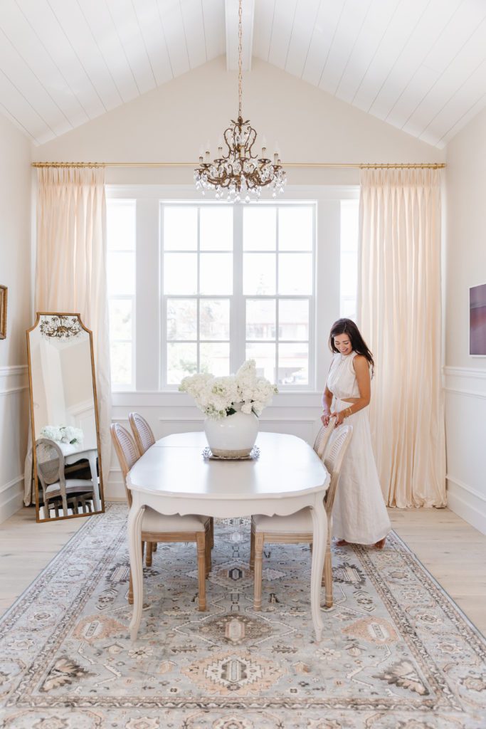
I knew I wanted something romantic and European-inspired to bring warmth to the space. Like all the windows in my main home (see here), I went with custom coverings from Lindsay at Q Design. She is the best, truly. For the dining/meeting area, I chose a luxe 100% Silk in White with 6″ 2 fold pleats with cotton lining and interlining. It instantly transformed the dining portion of the office, and fit perfectly with my Parisian theme. It reminds me of something from Versailles!
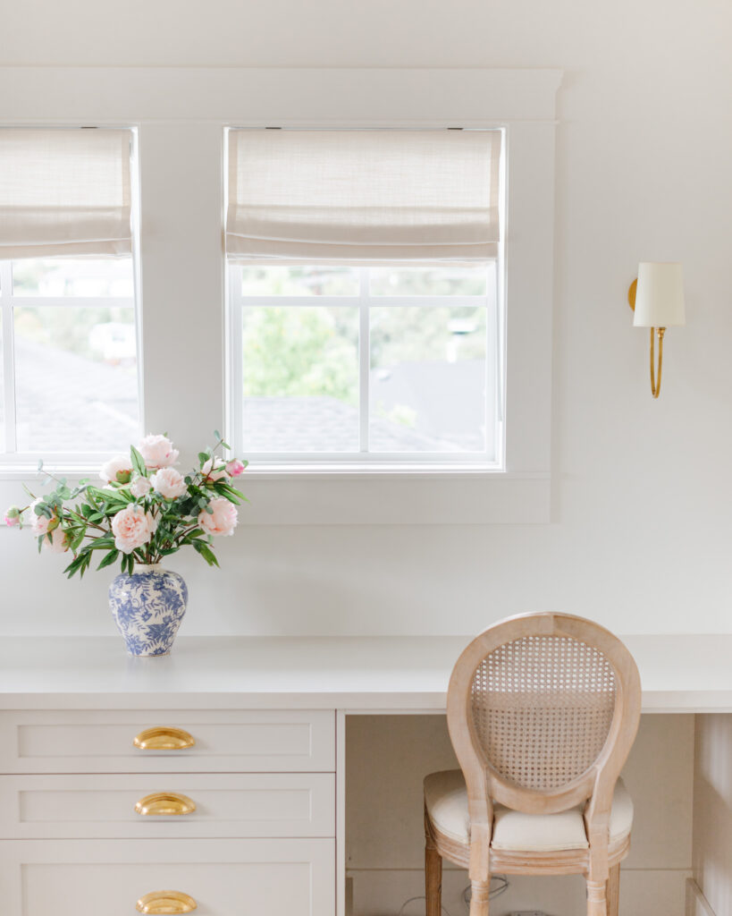
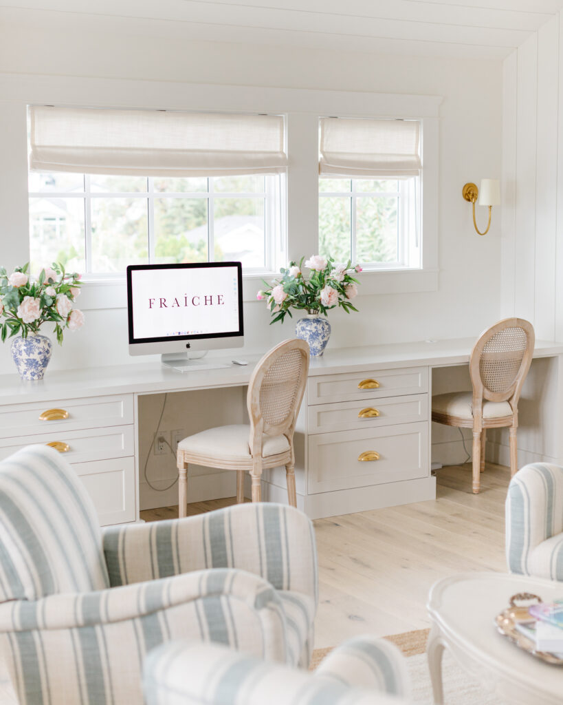
For the kitchen and desk built-in area, I went with linen roman shades in colour “Cotton.” The perfect creamy white! You can use code TORISWATCH10 for 10 free swatches for yourself with and code TORI10 FOR 10% off your next purchase.
P.S. Every year she has an incredible Black Friday sale! Subscribe here so you don’t miss it.
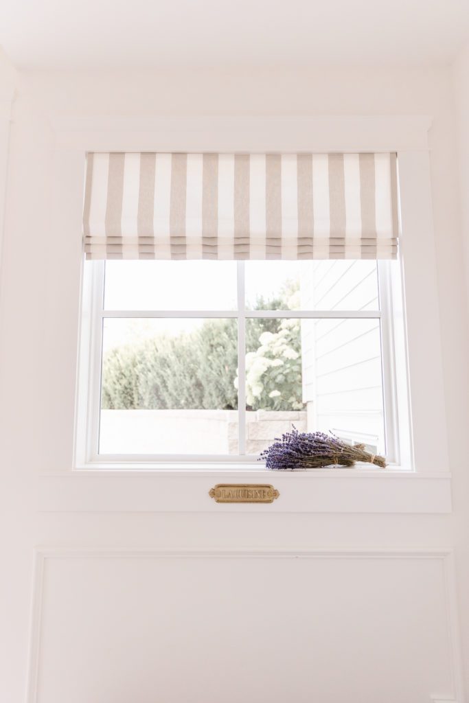
For the entrance to the office, we did a Valance in Murray Stripe in Macadamia, inside mounted with large folds and cotton lining. It adds the perfect je ne sais quoi to our little entry. To see more of my Q Design custom window coverings, head here.
Custom Desk Built-Ins
We needed proper work stations for my growing team, so my dear friends at Norelco installed a custom built-in that fits 3 people, plus loads of storage. We matched the cabinetry from the kitchen (Classic Gray) and the same brass hardware as throughout. Now, who wouldn’t want to work here?!
Pantry
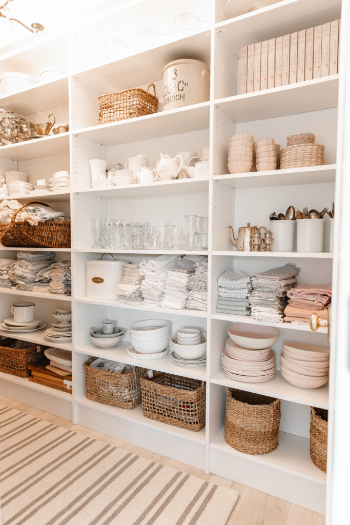
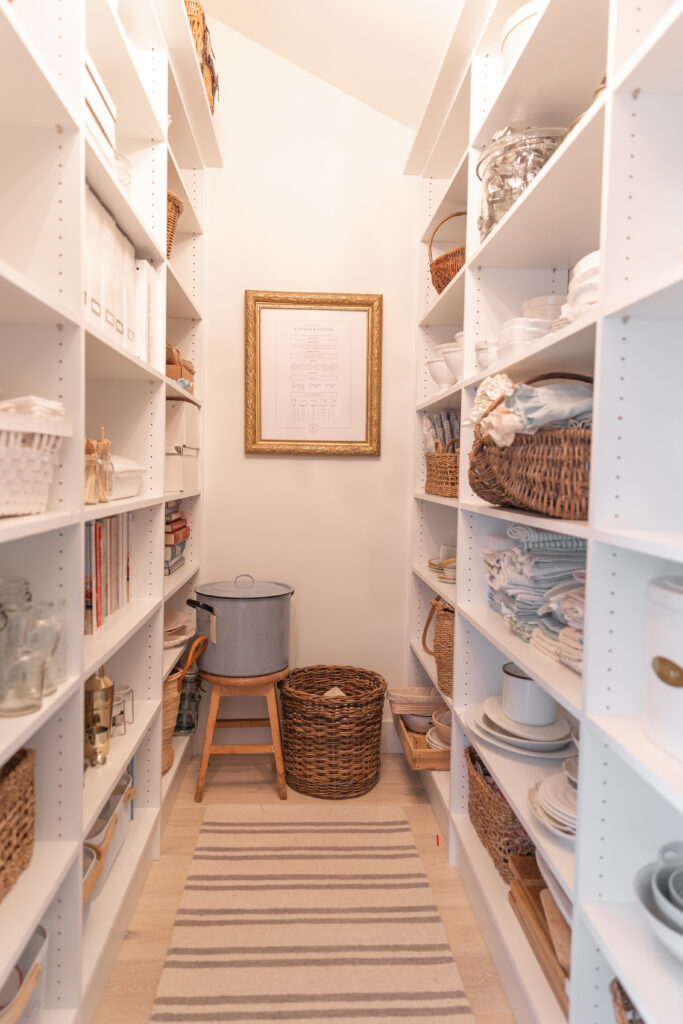
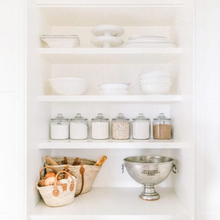
To say we have a lot of props and kitchen gadgets, would be a huge understatement. When building this space we made sure to add a small pantry to allow for extra much needed storage. Isn’t it darling? I can actually lock myself in there when I need a little mommy break. TOTALLY KIDDING!
Huge thank you to Tailored Living, who installed these built-ins that help keep us so organized (and sane lol)!
For more home decor resources you’ll have to read through the blogs on the other areas in my home!
- Pantry Reveal
- Kitchen Reveal
- Laundry Room Reveal
- Our Master Bathroom Reveal
- Our Top 14 Kitchen Features




So. so pretty! If we could update our kitchen, I feel it would look a lot like this! But alas…it’s a four year away plan…
So clean, bright, cheery and inviting!
Amazing ! Great job!
Thank you so much!! xx Tori
Awww the space is so gorgeous, Tori! The grey tone is stunning – well done team!
Gorgeous work space. What a joy it must be to work in a beautiful space like this everyday. Love seeing Fraiche continue to grow ! Great job 🙂
That’s so kind of you Kelly, thank you so much! Tori
What a beautiful space! No doubt you and the Fraiche team are very happy with your new work kitchen and office. Have you had any issues with your Silestone Statuario countertops and island? (cracks, chips, scratches, stains, colour fading)
Hey Nancy! No issues so far! I love the countertops!
So nice and bright! Love it!
Thank you!
Hi Tori,
Love your new office space, it’s bright and airy. Love that you did the gray cabinets as well, looks so classic with the brass hardware. Could you please share if you did the unlacquered brass finish or the polished brass? Thank you!
Hi Margo! Thanks so much! I went with the polished brass from emtek. I adore them!
Hey Tori,
The office looks really good! I can’t seem to find the link for the floor mirror, can you please link it and the chandelier?
Thank you!
Hey! I wish I could link but it was a lucky Home Sense find!!
It came out beautiful! Did you lightening the Classic Gray cabinet paint or did you use it at 100%? It’s stunning with the hardware.
Thank you! It is at 100%!
Hi Tori it turned out amazing!!! You must be in heaven with this new space!!
I’m actually looking for a link to your wallpaper that I spotted on stories today. Looks like it’s in your office bathroom. Thank you!!!
Thank you Jennifer! Yes it is from Wayfair! I think it is linked in the office section on our blog in the shop section.
Love the kitchen! Just finishing up ours and wondering where your table is from?
Thanks Carla it is a vintage table that we painted!
Hi Tori! This kitchen turned out to be so beautiful. I am trying to find a link to the backsplash you used. Do you know if it is available online? Thank you!
Hi Dakota! Sorry I don’t have a link I purchased it from a local store in town but I do know it is Olympia tile and it is a pillow subway – I hope this helps!
Thank you, Tori! I will contact them and see what I can find out. Is the color called pillow?
Hi Dakota I am quite sure this is it in white!
https://www.olympiatile.com/product/series/751/oxford
Hey Tori!
I only just “discovered” you, and I must say, I love your style! May I ask where you purchased your area rug under your office dining table?
Hi Justyna, thank you so much! It is from Urban Barn!
Hi! I’m confused at the hardware finish. Normally I thought only unlaquered brass patinas over time, but you went with Emtek polished brass?
Hi Mallory it is indeed unlacquered in the office and it is a sealed finish in the rest of my house, Antique Brass
Hi Tori!
Those rattan chairs look lovely! Where did you purchase them?
Hi Tori!
Those rattan chairs look lovely! Where did you purchase them?
Hi Winnie! Here is the link: https://rstyle.me/+dz2bScPMPT5lStsZyHhTVQ
xx Tori